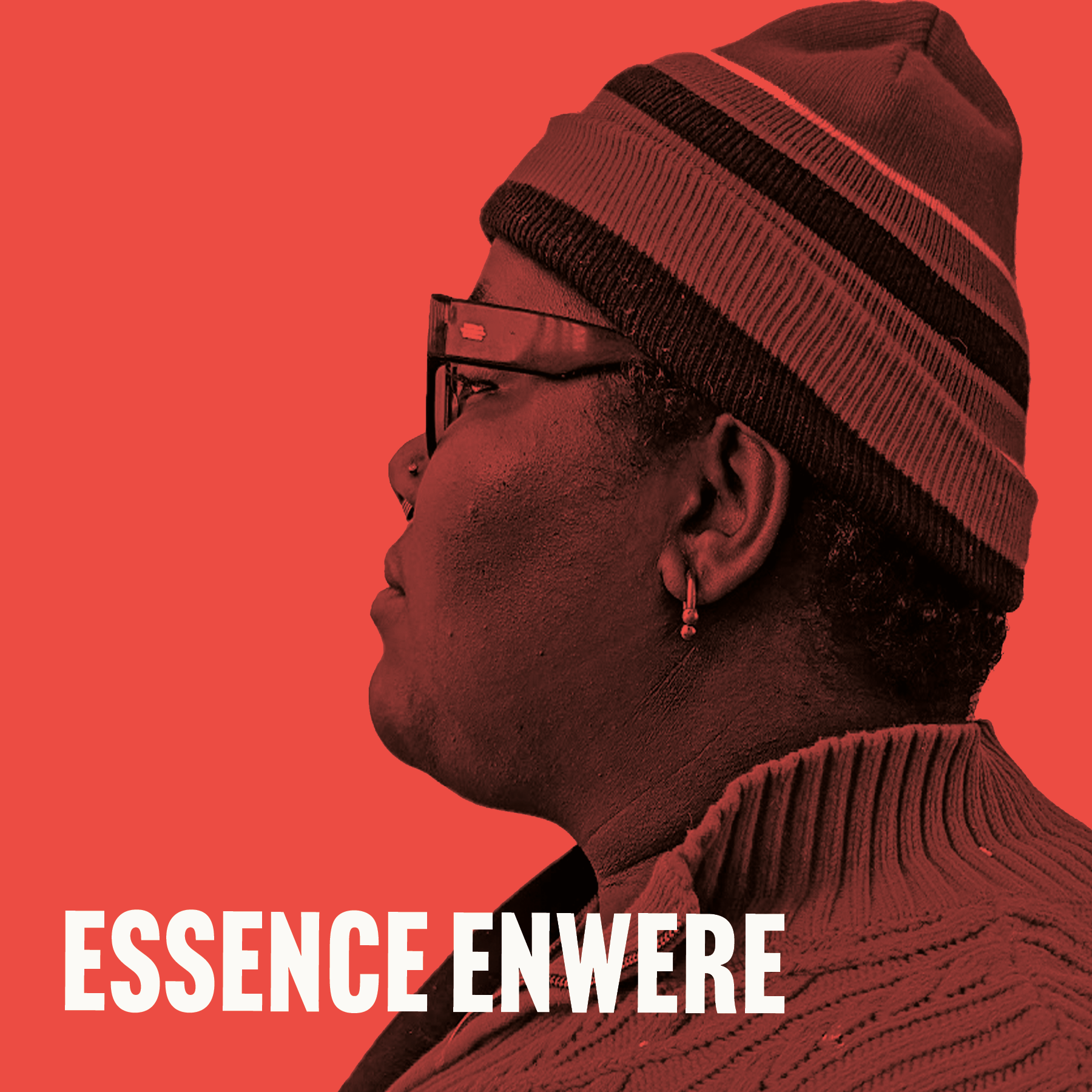
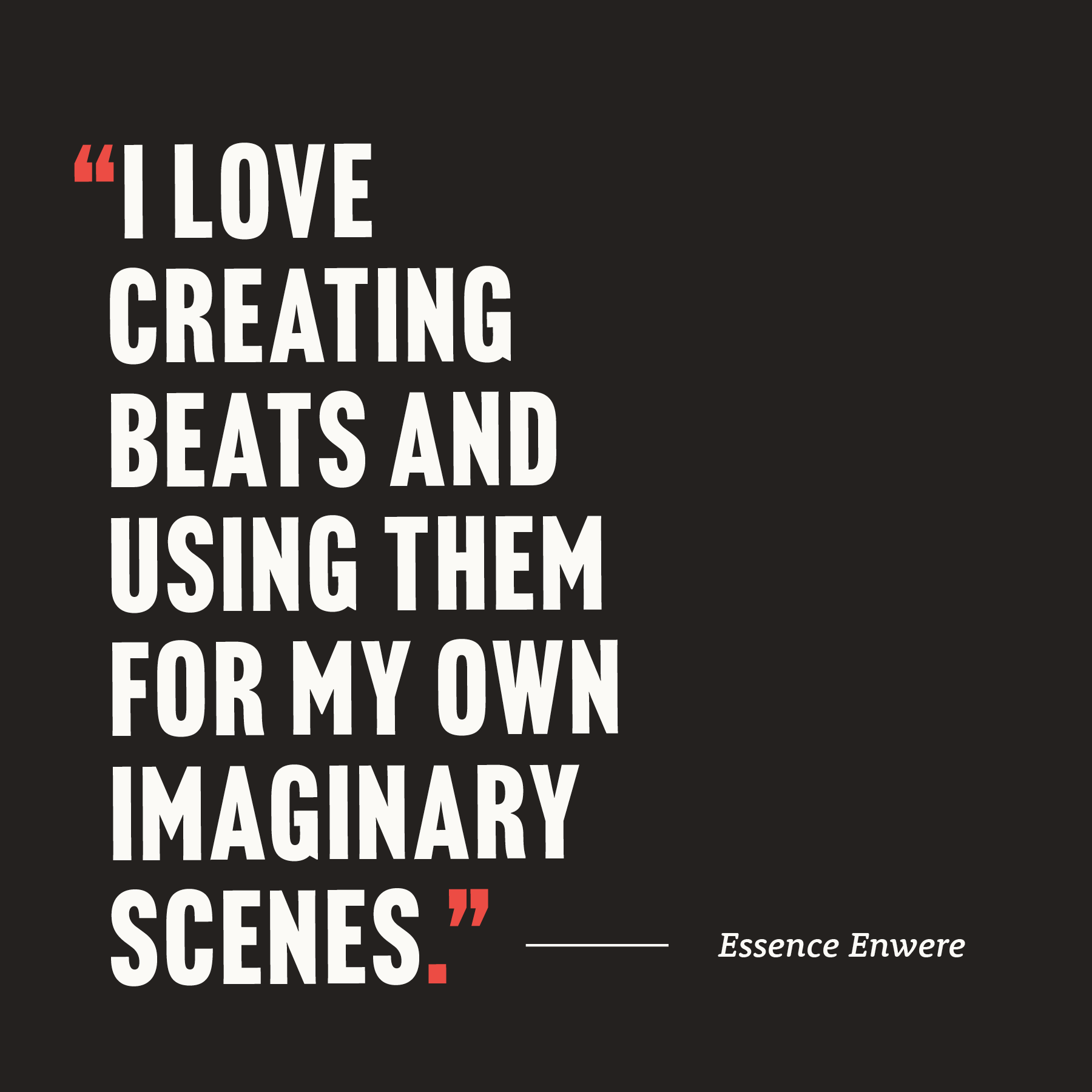
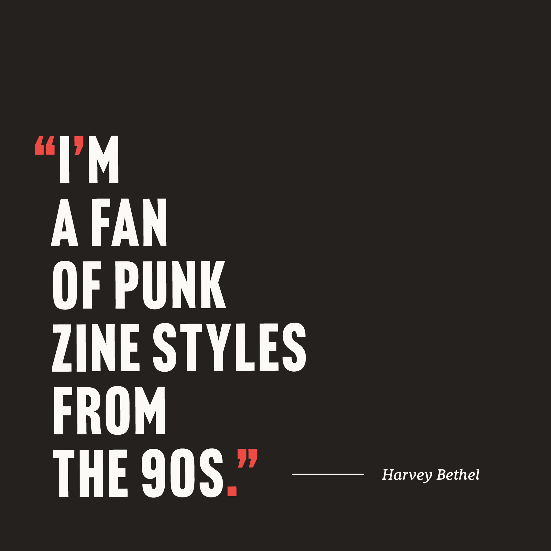
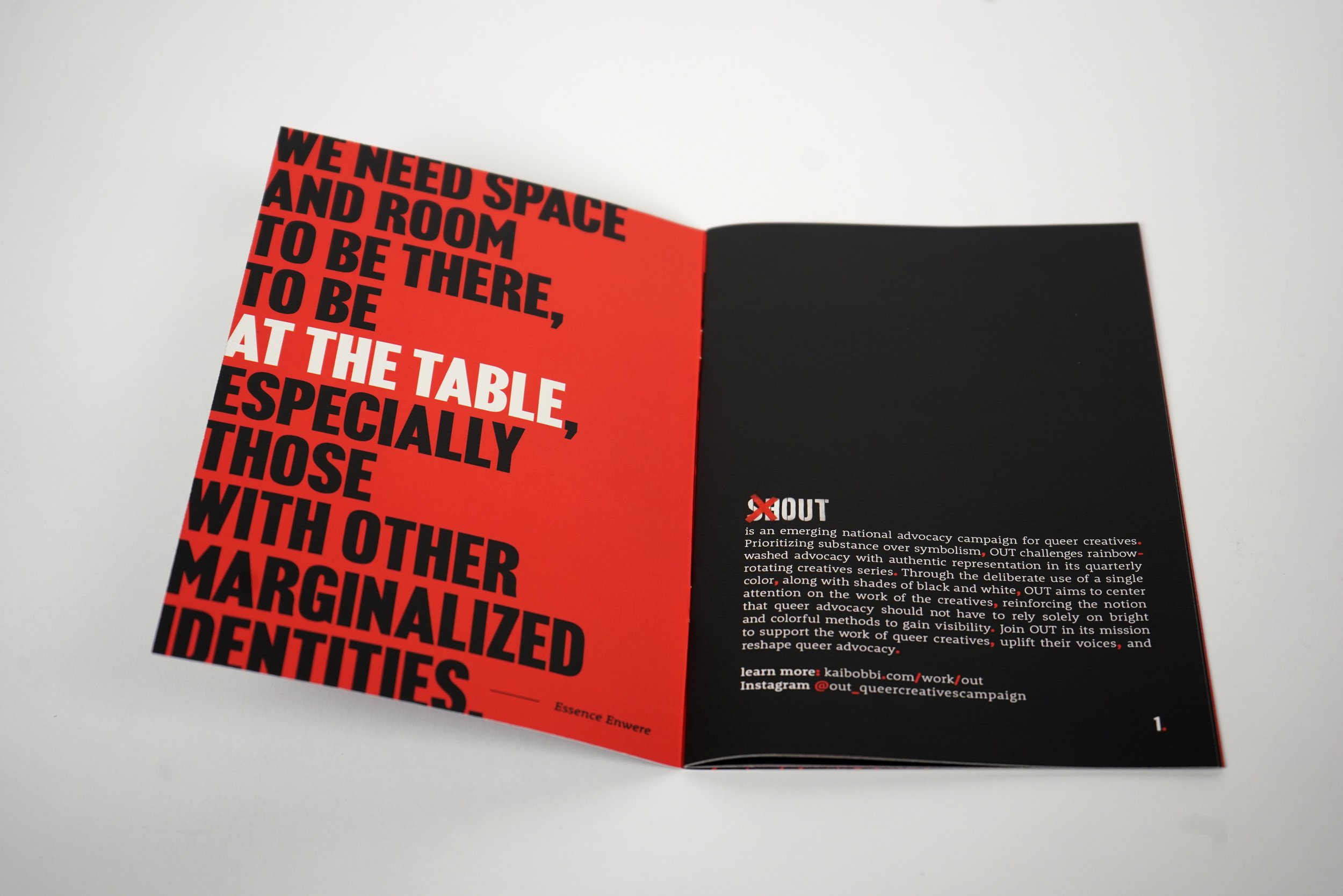
is an emerging national advocacy campaign for queer creatives. Prioritizing substance over symbolism, OUT challenges rainbow-washed advocacy with authentic representation in its quarterly rotating creatives series. Through the deliberate use of a single color, along with shades of black and white, OUT aims to center attention on the work of the creatives, reinforcing the notion that queer advocacy should not have to rely solely on bright and colorful methods to gain visibility. Join OUT in its mission to support the work of queer creatives, uplift their voices, and reshape queer advocacy, because people shouldn't have to shout to be out. Follow on Instagram @Out_queercreativescampaign OUT
CATEGORY: Publication | Brand Identity Campaign | Social Media
YEAR: 2024
MEET THE CREATIVES
EXHIBITION OUT NOW
OUT is available for viewing now at UMN's 2024 Senior Exhibition!
May 1 - May 10 @ Rapson Hall in Minneapolis, MN 
WHAT’S WITH THE COLORED PUNCTUATION?
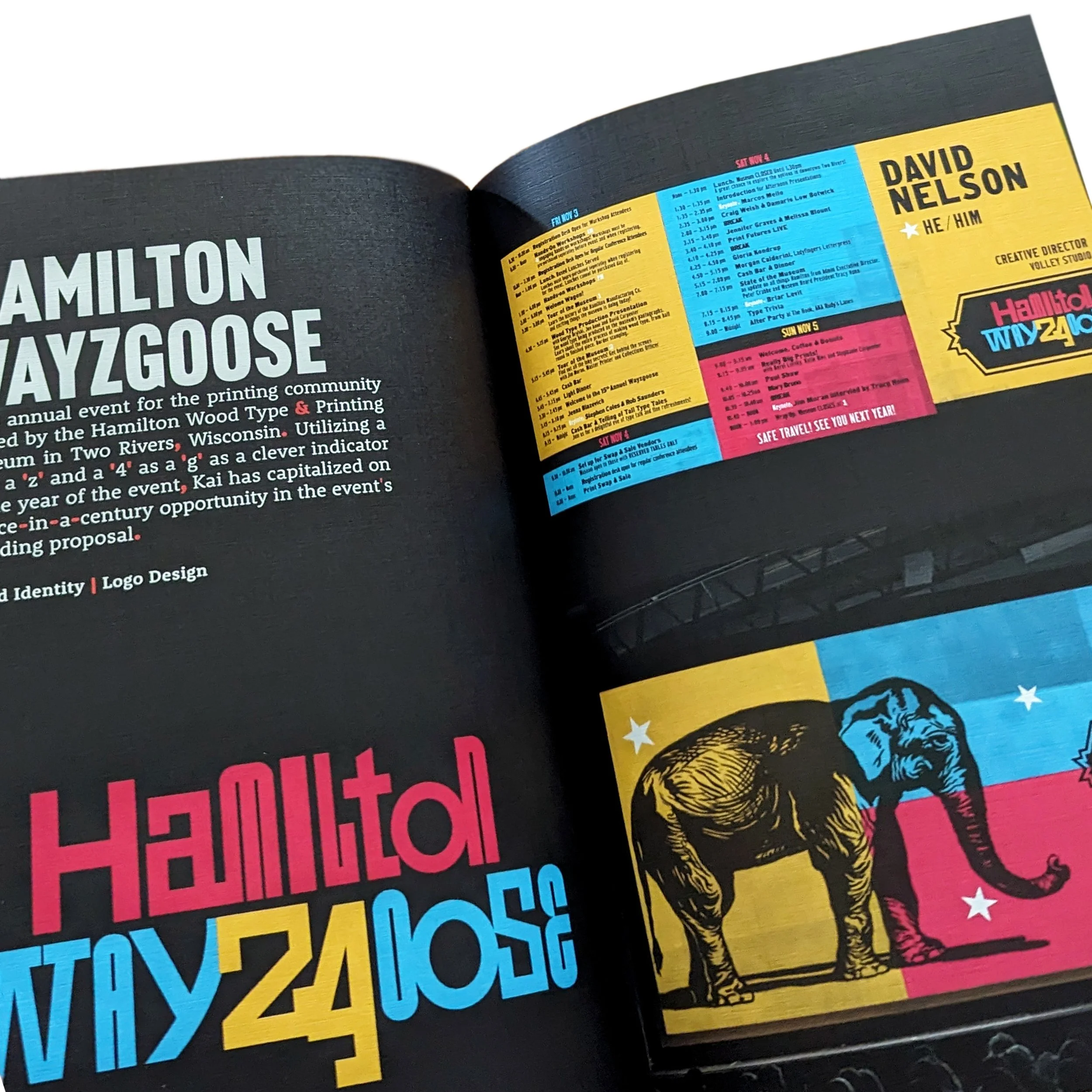
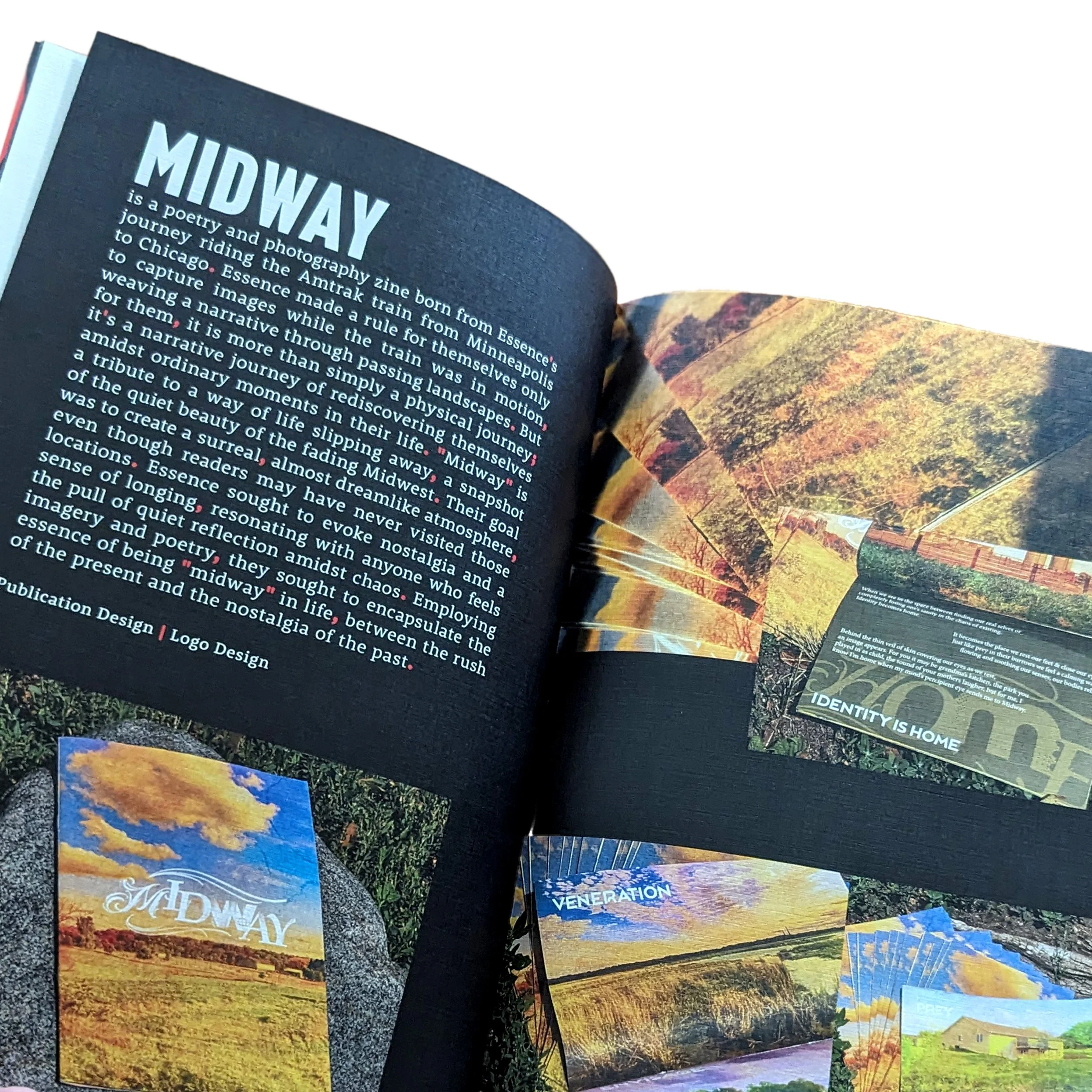
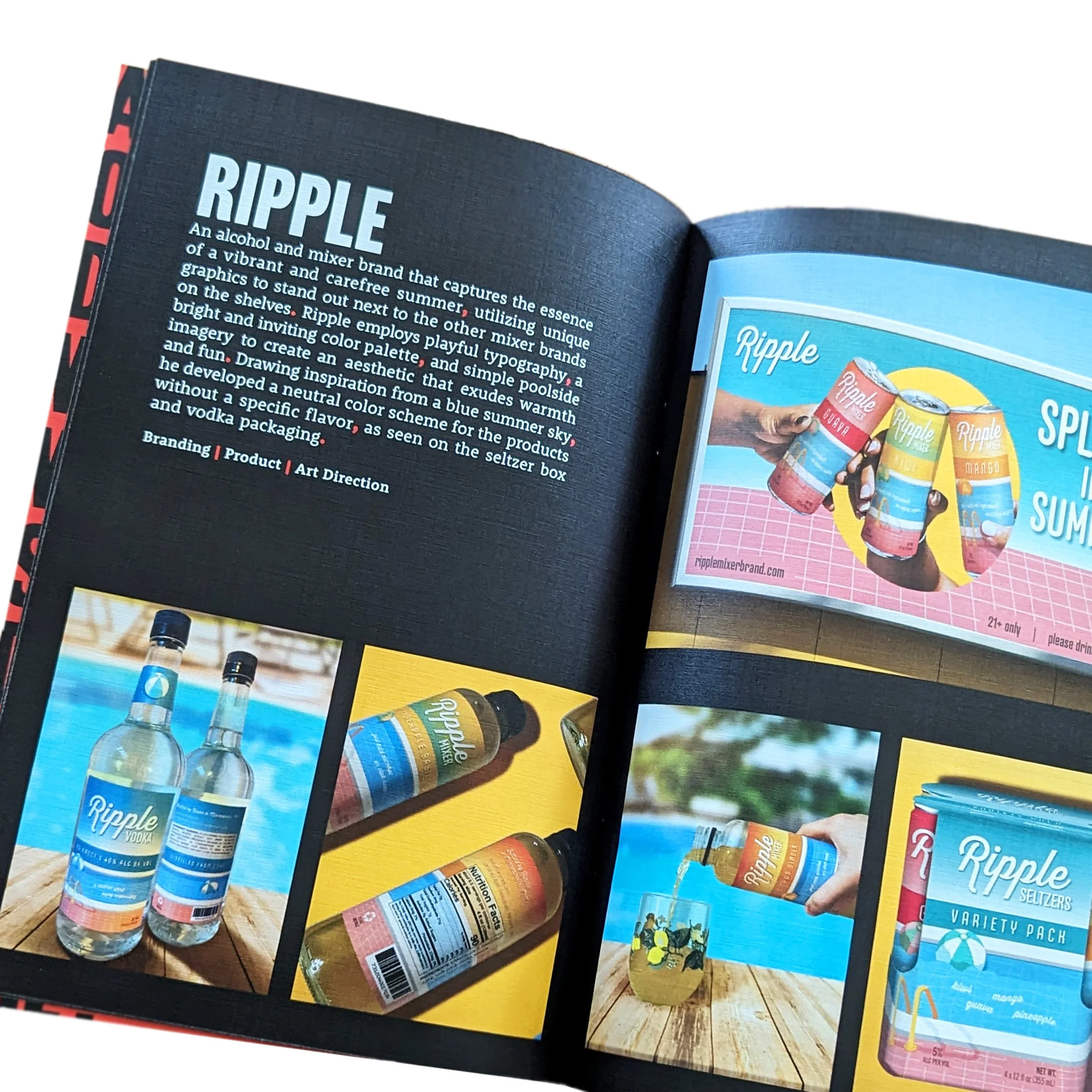
OUT's bolded, bright red-orange punctuation symbolizes the resilience and vibrancy of queer individuals, emphasizing their bold presence and unapologetic visibility in a society often inclined towards conformity. It serves as a nod to vibrant queer creatives deserving consideration and appreciation for their contributions to conversations within world of art and design. OUT challenges traditional symbolism and serves as a rallying call for more genuine, deeply-rooted advocacy that celebrates the multifaceted experiences of the queer community.A glimpse into the publication
GET OUT THERE!
OUT aims to be space where queer voices can be heard and given space to be heard. If you are looking to get involved in OUT's continued development or are a queer creative who is interested in being featured in the future publications, feel welcome to reach out. 

